Redesigning Nepal's first user friendly cloud ERP.
Making enterprise accounting software as intuitive as scrolling social media, accessible
to every business in Nepal, without training, without fear.
My Role
Product Designer
Timeline
1.5 Years
Tools
Figma · Miro · Google Sheets
Outcome
Live · 3× subscription growth
01 — Context
ERP was a four letter word in Nepal.
In Nepal, enterprise software like Tally is seen as a necessary evil. Businesses pay for multi day training
sessions just to create a basic invoice. Desktop first tools dominate, but mobile phone adoption is
skyrocketing, yet no ERP felt built for that shift.
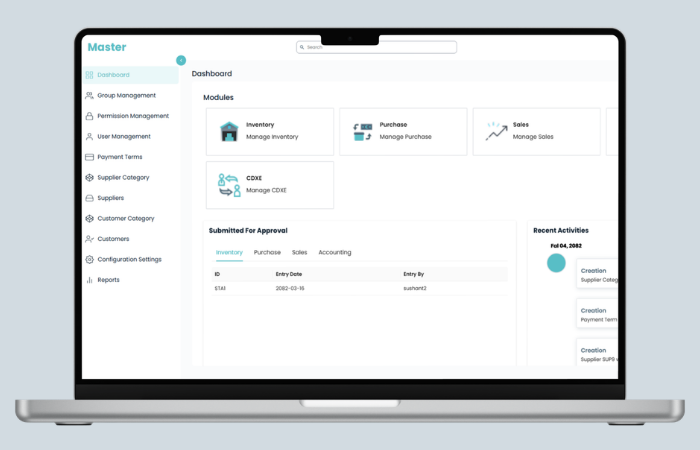
The existing Providhy system had a structural problem: users had to navigate through a Tenant Portal
→ Master Section just to access core modules like Inventory, Sales, or Purchase. Every task
required jumping between completely separate navigation contexts. Nothing was connected.
Businesses were refusing the product, not because they didn't want cloud ERP, but because the cost
of learning it felt higher than the benefit of using it.
The legacy system, before redesign
Before
The "Master" served as a confusing portal. Users had to click a module card and then navigate to a
completely separate sidebar context.
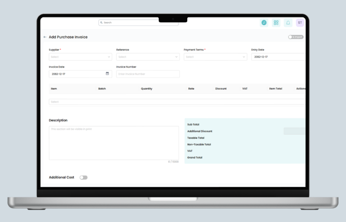
Before
Invoice forms had scattered fields, a massive description box pushing totals off screen, and multiple
separate action buttons with unclear hierarchy.
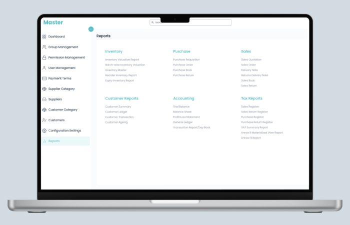
Before
Reports was a wall of 25+ plain text links across 6 columns with no visual hierarchy. Users had to
read every item to find what they needed.
02 — Discovery & Research
I learned accounting before I opened Figma.
I had no prior accounting background. Rather than jumping straight into interface design, I spent the first
weeks learning how businesses actually operate, how sales flow into purchase, how inventory connects to
invoicing, how VAT reporting works under Nepali fiscal law.
How I researched
Sat with business owners: watched real workflows, observed where they paused, got
stuck, or used workarounds
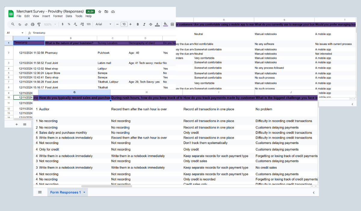
Ran merchant surveys: gathered quantitative data on how businesses track sales, manage
rush hours, and handle inventory
Interviewed customer support: over 60% of recurring tickets were navigation related
Studied competitors: mapped Tigg, Finpro, Dynamic ERP, and Tally across pricing,
features, and deployment
Shadowed accountants: particularly to understand keyboard heavy workflows and Tally
muscle memory
📓
Most merchants weren't recording at all during rush hours
"Customers delaying payments" was the #1 management challenge
This directly informed why Receivables vs Payables became a central
dashboard widget.
📦
Most didn't track inventory systematically at all
Manual counting dominated. This validated the need for simple bulk
upload, not complex inventory management.
🗂️
Credit payments were tracked separately, or not at all
Multiple respondents kept "only credit" records. Informed the Quick
Payment toggle design on invoices.
Raw merchant survey data. Real business owners told us how they record sales, manage
rush hours, track payments, and handle inventory challenges.
Competitor landscape
The Nepali ERP market was feature focused but usability blind. Every competitor competed on pricing tiers and
feature checklists. Nobody was competing on ease of use. That was our opening.
Product
Deployment
Pricing (Web)
Industry Focus
Key Gap
Our Advantage
Tigg
Cloud + On Premise
Rs. 15,000–32,000/yr
Manufacturing, Retail
Complex onboarding, no focus on UX
Our win Simpler flow, faster onboarding
Finpro
Cloud + Desktop
Rs. 1,000/user/mo
SMEs, Finance
Desktop first mindset, offline dependency
Our win Cloud native, mobile accessible
Dynamic ERP
Cloud
Rs. 35,000–55,000/yr
Manufacturing, Logistics
Custom quotes, high barrier to entry
Our win Transparent pricing, self serve
Tally (Incumbent)
Desktop only
One time + training
All sectors
Requires days of training, no cloud access
Our win Zero training goal, cloud first
Providhy (Us)
Cloud native
Subscription
SMEs, All sectors
UX needed complete redesign
Target Easiest ERP in Nepal
Competitor analysis across 4 local ERP providers + Tally. Key insight: everyone
competed on features. Nobody competed on experience. Data source year: 2025.
Key insight from research
Users didn't want fewer features. They wanted faster access to the features they
already knew they needed. The problem wasn't scope, it was architecture.
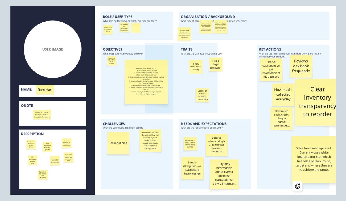
02b — User Personas
Who we were designing for.
After research synthesis, I created personas in Miro to align the team around the real users, not
assumed ones. The primary persona, Ram Hari, represented the business owner archetype we encountered
most frequently: digitally hesitant, operationally experienced, and deeply motivated by business control
and visibility.
User persona created in Miro during the discovery phase. Ram Hari represents the
primary user archetype, a business owner and distributor who wants full visibility but has low
technology confidence.
👤
Ram Hari
Business Owner ·
Distributor
Head of a distributor association. Operates in Jhapa area. 45 years old, manages business with
25 years of experience. Not familiar with technology.
"I want to run my
business with all the control with me."
🎯
Objectives & Key Actions
Checks dashboard daily for business overview. Reviews day book frequently. Wants to
know:
👉🏻 How much to be received & paid
👉🏻 Cheques received & conversion rate
👉🏻 Cash in ATM vs receivables
👉🏻 All items sorted by date
👉🏻 Separate records for internal & IRD
👉🏻 Wants to go digital this year
⚠️
Challenges & Needs
Pain points:
Technophobia. Wants market monitoring but existing system lacks proper tools. Currently uses a
whiteboard for sales force management.
Needs:
Simple navigation. Heavy dashboard with full business status. Day to day transaction visibility.
Clear inventory levels for reordering. Cash, credit, cheque, partial payment tracking.
How this persona shaped design decisions
Ram Hari's profile directly influenced three major decisions: (1) The dashboard
became a command center showing financial position at a glance, not a module launcher.
(2) Navigation was designed to be explorable without training, clear labels, no
jargon in wayfinding. (3) The Receivable Aging Summary and Payable Due table
were
prioritised on the dashboard because Ram Hari's primary anxiety was "who owes me money and when do I
owe someone else."
03 — Design Decisions
Five decisions that changed the system.
With research complete, I mapped out the existing information architecture and identified five structural
problems that no amount of visual polish could fix. Each required a deliberate architectural decision.
Decision 1 — Navigation architecture
The old system had a fatal flaw: "Master" was a portal hub, not a workspace. Every module (Inventory, Sales,
Purchase, Accounting) had its own completely separate navigation context. Switching modules meant starting
over mentally.
I explored three approaches:
Option A: Full mega sidebar: All modules and sub features in one panel. Too cluttered
for 30+ items. Overwhelming for new users.
Option B: Top navigation only: Horizontal tabs across the top. Doesn't scale. Creates
scanning problems at wider viewports.
Option C: Hybrid: Persistent sidebar + contextual top tabs: Sidebar holds high level
modules (always visible). Top tabs handle sub navigation within each module. ✓ This is what we built.
The hybrid approach meant users could stay in their "mental space" (e.g., working in Sales all day) while top
tabs gave fast switching between Invoices, Quotations, Orders, and Returns, without ever losing module
context.
Navigation: before & after
Before: Disconnected Modules
Master acted as a hub. Each module had independent navigation. Switching modules meant starting from
scratch, losing context and momentum.
After: Unified Navigation System
Persistent sidebar for module context. Top tabs for sub section switching. The global "+ Create"
button provides quick entry from anywhere in the system.
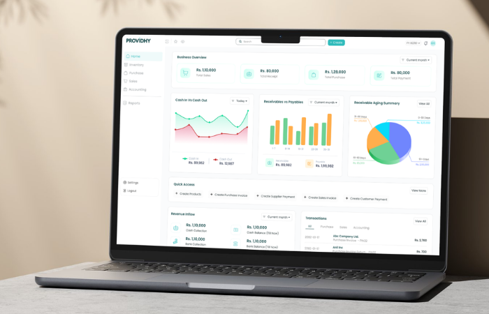
Decision 2 — Dashboard as command center
The old dashboard was a module launcher with an approval queue. It answered the question "where do I go?" but
not "how is my business doing?"
Based on the merchant survey, the top business anxieties were: cash flow, overdue receivables, and pending
supplier payments. The new dashboard was designed to answer these questions instantly, without navigating
anywhere.
1
Business Overview KPIsTotal Sales, Total Receipt, Total Purchase, Total Payment at a glance. Answers the most common
daily question immediately.
2
Cash In vs Cash OutLine chart with date filtering. Directly addresses the survey finding that cash flow was
merchants' primary concern.
3
Receivable Aging SummaryPie chart showing 0–30, 31–60, 61–90, 91+ day buckets. Instantly shows who owes you and how
urgently to follow up.
4
Quick Access BarMost frequent actions (Create Invoice, Add Payment, Add Product) surfaced directly on the
homepage. Reduces navigation depth for daily tasks.
5
Payable Aging TableUpcoming supplier payments with "Due in X days", prevents surprise payment delays and
supplier relationship strain.
6
Live Transaction FeedAll module transactions in one filterable view. Replaces the old "Recent Activities" log which
only showed system events, not business transactions.
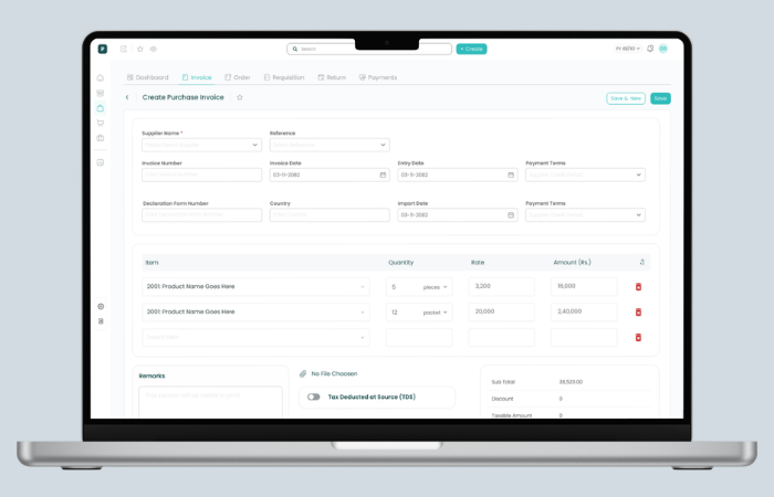
Decision 3 — Invoice form redesign
The invoice form was users' most frequent pain point. In the old design, a massive description text area
pushed financial totals below the fold. Users scrolled constantly and lost their place. The action buttons
(Save as Draft / Post Bill) competed with no clear visual hierarchy.
In the redesign, I grouped fields logically (Supplier/Customer → Reference → Dates → Line Items → Totals),
brought Quick Payment and Additional Cost up as clearly labeled toggles, and kept totals persistently
visible in the right panel regardless of line item count.
Usability test failure — and the fix
In Round 1 testing, users who selected products on line items were confused by the "available
stock" indicator, they thought it was mandatory to verify stock before adding. We made it
contextual and optional: shown on hover, not on focus. The confusion disappeared
entirely in Round 2.
Purchase Invoice: before & after
Before
Fields scattered across full width. Massive description box. Totals pushed to bottom-right. Quick
Payment as an afterthought toggle at the very bottom.
After
Grouped header fields. Clean line items table with Amount visible. Totals panel always visible. Top
module tabs for context. Quick Payment and Additional Cost as clear feature toggles.
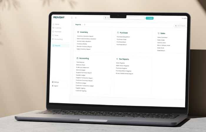
Decision 4 — Reports from wall of text to structured hub
The old reports page was arguably the biggest usability failure in the system. 25+ report names in 5 columns
of plain text. No icons, no categories, no hierarchy. Users had to read every single item to find what they
needed.
The redesign introduced clear category groupings with icons, consistent layout, and a search
bar — a deliberate decision for power users who know the report name but don't want to scan the
full list.
Reports page: before & after
Before
Five columns of unstyled text links. No icons, no grouping hierarchy, no search. A 30 second scanning
task every time.
After
Categorized sections with icons (Inventory, Purchase, Sales, Accounting, Tax Reports). Search bar for
power users. Clean card layout. Favorites support via ☆ bookmark.
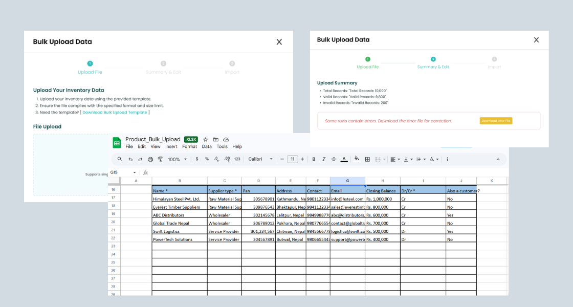
Decision 5 — Bulk upload as a first class feature
Adding 50 inventory items one by one was causing user churn before launch. Bulk upload wasn't a "nice to
have," it was the deciding factor for whether a business could even start using the system.
I owned the end to end flow design: defining the required data format, the template generator, the 3 step
upload modal (Upload → Summary & Edit → Import), and all error states with row specific feedback.
The critical design decision was introducing a template generator. Users wanted to upload
their existing Tally exports directly, but Tally's export format was inconsistent across versions. Our
template gave us control over data quality while giving users a familiar spreadsheet based workflow.
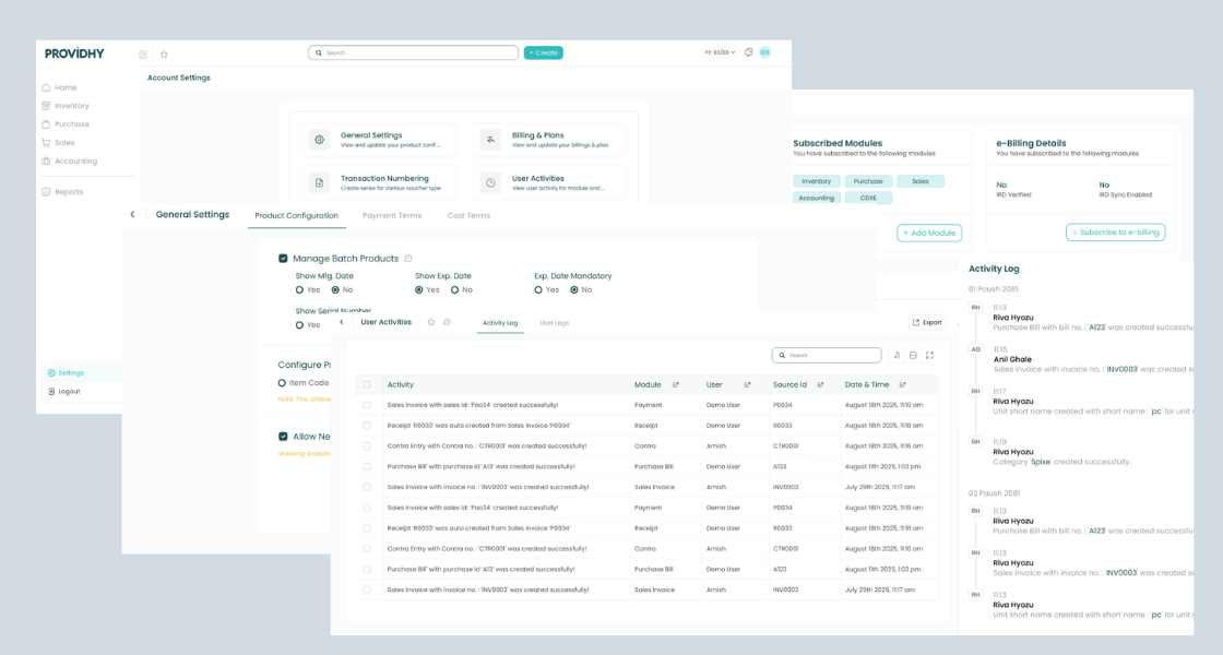
The old Configuration Settings page buried critical options (user permissions, billing, numbering systems) in
tabs inside a single page. The new Settings hub uses a card grid pattern, each card has a title, icon, and
description, so users can immediately understand what a setting controls without clicking into it first.
Account Settings hub: General Settings, Billing & Plans, Transaction Numbering, User
Activities, Notifications, Users & Permissions, Company Info, Party Management — all accessible at a glance.
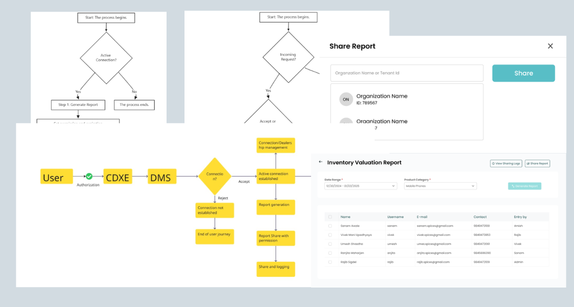
05 — CDXE Module
Designing a distributor connection network.
Beyond the core ERP, I also mapped the user flow for CDXE, which is a distributor management system module
that
allows businesses to connect with dealers and distributors through the platform. The module handles
authorization, connection requests (Accept/Reject), order management, and automated notifications.
I created the full flow diagram to communicate the multi party interaction model to the engineering team
before UI design began, ensuring the technical architecture matched the user journey before any screens
were created.
CDXE
module flow: User authorization → DMS connection → Accept/Reject → Active connection branches into report
sharing, dealer ordering, and dispatch tracking.
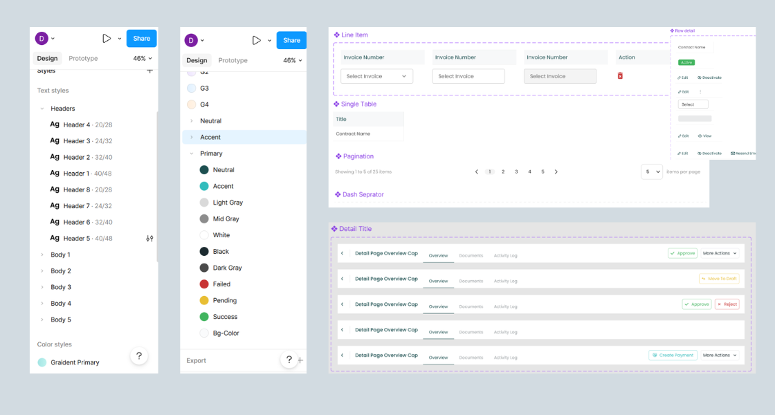
06 — Design System
Components that became the company standard.
As the sole designer working across Inventory, Sales, Purchase, and Accounting modules, consistency was
critical. I built a component library in Figma covering the core patterns used across every module, table
layouts, row interactions, line item inputs, pagination, and status indicators.
These components weren't just for the ERP. The navigation pattern and component library became the
company wide standard, adopted across all subsequent Providhy products.
Core
component library: Column table, Row detail states (Active/Edit/View), Line Item input, Single table,
Pagination, and Dash separator, reused across 4+ modules.
07 — Localization
Built for Nepali business, not adapted from elsewhere.
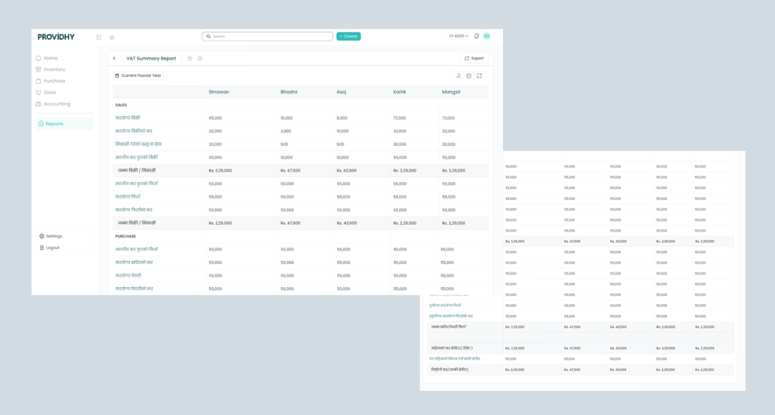
One of the strongest design decisions was committing to deep localization, not just translating labels, but
designing around Nepali fiscal reality. The VAT Summary Report uses Nepali fiscal month names (Shrawan,
Bhadra, Asoj, Kartik, Mangsir), Nepali accounting terminology (करयोग्य बिक्री, जम्मा बिक्री/निकासी), and the
Nepali fiscal year format (FY: 82/83).
Early in the project I had tried to simplify accounting terms into plain language. User testing proved this
was wrong, accountants and business owners wanted the exact terms they recognized from IRD tax
forms. Familiarity wasn't a limitation to design around. It was a feature to design with.
VAT Summary Report: Nepali fiscal months as column headers, IRD standard terminology
in Nepali, fiscal year selector, and multi column layout matching the government tax filing format.
08 — Outcomes & Impact
40s
Average invoice creation time, down from 3+ minutes in the old system
3×
Subscription growth in 2 months post launch, from 10 to 30 paying
businesses
60%
Drop in navigation related support tickets after launch
1×
Design system, new navigation pattern became the company wide standard
across all products
"Finally, an ERP that doesn't make me feel stupid. My team figured it out without any
training."
— Business Owner, Kathmandu
"I don't have to call support for navigation anymore. Actions that took 3 minutes now take
40 seconds."
— Operations Manager, Post Launch
"The reports section actually makes sense now. I used to avoid it. Now I check it every
morning."
— Accountant, Providhy User
09 — Reflection
What I'd do differently.
Design for keyboard users from day one
I underestimated how deeply accountants rely on keyboard shortcuts. Tally users had years of muscle memory:
Tab to move between fields, Ctrl+A to add, Enter to confirm. We built shortcuts post launch, but they should
have been foundational. If I were starting over, I'd run a keyboard navigation session in the first round of
user testing.
Test with real, messy data earlier
Our initial bulk upload tests used clean, well formatted spreadsheets. Real user data was chaos merged
cells, inconsistent product codes, missing required fields. We fixed the error states post testing, but the
friction could have been anticipated if we'd asked users to bring their actual Tally export files to the
first session.
Familiarity is a feature, not a constraint
The biggest mindset shift I had during this project: in consumer products, innovation is rewarded. In B2B
enterprise software especially in a market where users are migrating from a deeply familiar tool
familiarity reduces friction. The best design decision I made was keeping IRD standard
accounting terminology, even when simpler alternatives felt cleaner. Users didn't want simpler words. They
wanted the words that matched their mental model and their legal obligations.
"One design decision can change the way a whole business operates. That's the weight of
enterprise UX and why I take it seriously."
— Personal reflection on this project
10 — Website Redesign
Fixing the front door while rebuilding the house.
While redesigning the core ERP product, a critical problem emerged: the marketing website wasn't converting
visitors into trial signups. The product was getting better, but the acquisition funnel was broken. Bounce
rates were high, value proposition was unclear, and visitors couldn't understand what made Providhy
different from Tally or competitors.
I led the complete website redesign across homepage, pricing, contact, module pages, blog,
documentation, and tutorials, working cross functionally with marketing, sales, and product
teams to align messaging with real user needs discovered during ERP research.
The conversion problem
After analyzing session recordings, heatmaps, and running conversion funnel analysis with the marketing team,
three critical issues surfaced:
Weak value proposition: Visitors couldn't quickly understand what made Providhy
different from Tally or other ERPs within the first 5 seconds
No trust signals: Missing social proof, customer logos, testimonials, especially
critical in a market where businesses are skeptical of cloud software
Friction in signup flow: Trial signup asked for payment details upfront, causing 60%+
drop off before even trying the product
Feature focused messaging: Old site listed features. Users wanted to know what
problems it solved, not what buttons it had
Cross functional discovery process
Before opening Figma, I ran structured discovery sessions with three teams:
Marketing team: Analyzed top acquisition channels, bounce rates per page, which landing
pages converted best, and where visitors dropped off
Sales team: Identified the 5 most common objections prospects raised during demos: "Is
it as powerful as Tally?", "Can I access it on mobile?", "What if internet goes down?", "How long to
migrate?", "Is my data safe?"
Product team: Reviewed actual feature usage data from existing customers to understand
which modules were used most vs which were just marketed loudly
Success & failure metrics (defined upfront)
Before design began, we aligned on measurable outcomes with stakeholders:
Success Criteria
Success: 25%+ increase in trial signups, 15%+ increase in avg. time on page, 40%+
reduction in "What does Providhy do?" support emails, improved qualified lead quality reported by sales
team.
Failure: No change in signup rate after 60 days live, increase in bounce rate, drop in
qualified demo requests, negative feedback from sales on lead quality.
Design decisions across key pages
The redesign wasn't just a visual refresh. Each page was architected around a specific user goal and business
outcome:
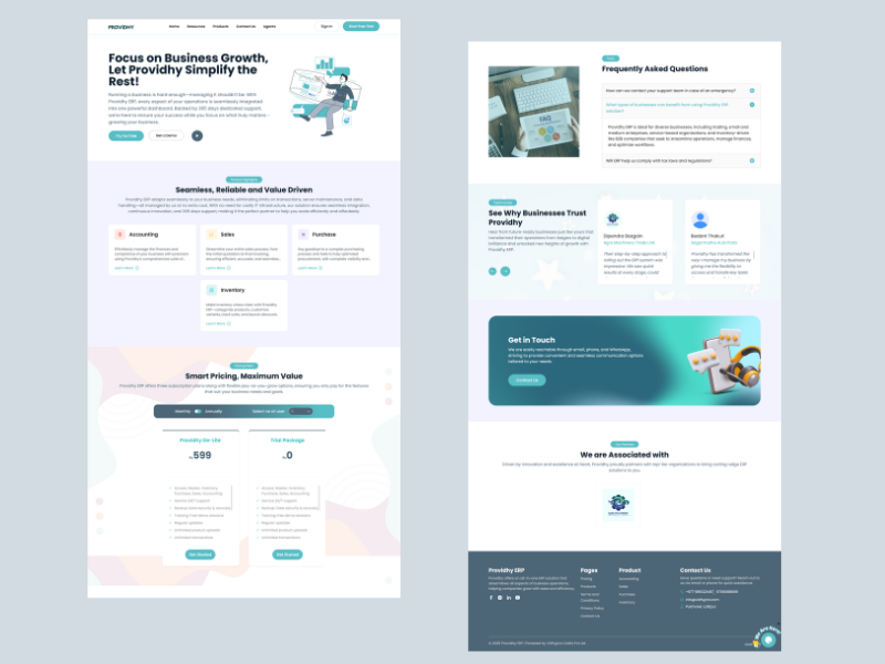
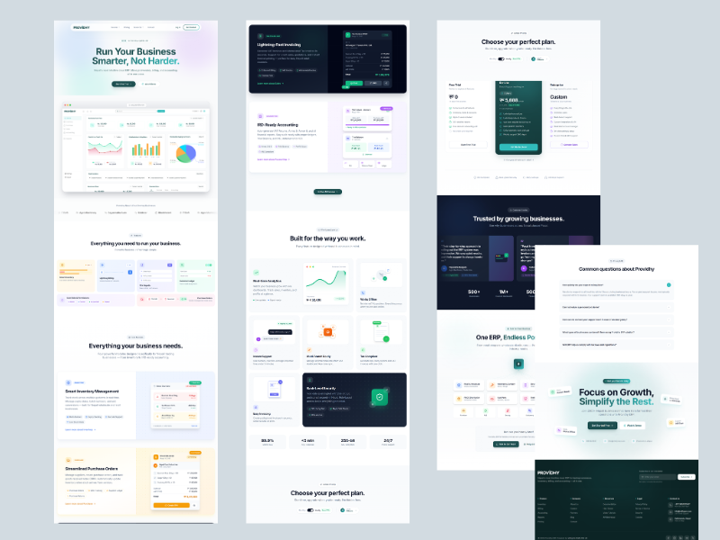
Homepage: Shifted from feature list to benefit driven hero messaging. Added social
proof above the fold (customer logos, testimonial preview). Introduced "See it in action" video demo to
reduce uncertainty. Streamlined CTA hierarchy: primary = Start Free Trial, secondary = Watch Demo.
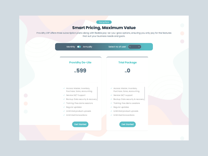
Pricing page: Redesigned from confusing tier table to clear comparison grid with "Most
Popular" tag on mid tier. Added FAQ section addressing common sales objections. Introduced annual vs
monthly toggle with savings callout. Removed payment requirement from trial signup (moved to post trial
conversion).
Contact page: Replaced generic form with contextual options: "Book a Demo" (for sales),
"Get Support" (for existing users), "Partnerships" (for resellers). Added expected response time and
live chat widget for instant queries.
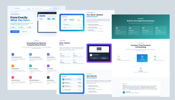
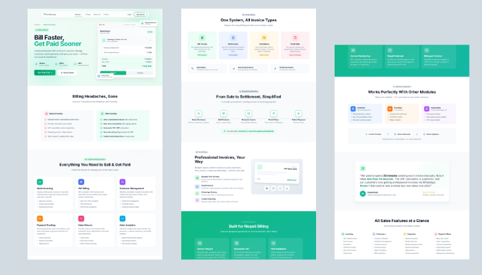
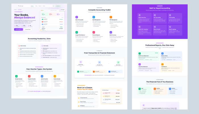
Module pages: Created dedicated pages for each ERP module (Inventory, Sales, Purchase,
Accounting) with module specific screenshots, use cases, and customer stories. Designed for SEO
targeting ("inventory management software Nepal").
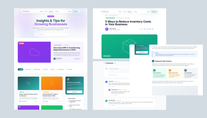
Blog: Designed content hub with category filtering (Product Updates, Accounting Tips,
Business Growth). Optimized for thought leadership and organic search traffic.
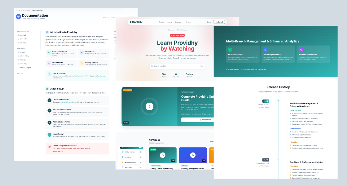
Documentation & Tutorials: Built structured help center with searchable docs, video
tutorials, and step by step setup guides. Designed to reduce onboarding support burden and improve
self serve activation.
Homepage redesign: before & after
Before
Feature first messaging. No trust signals. Weak visual hierarchy. CTA buried below the fold. Generic
stock imagery.
After (Design Complete, In Development)
Benefit driven hero. Social proof above fold (customer logos + testimonial). Clear CTA hierarchy.
Product screenshot showing real dashboard. Trust badges (secure, cloud, mobile ready).
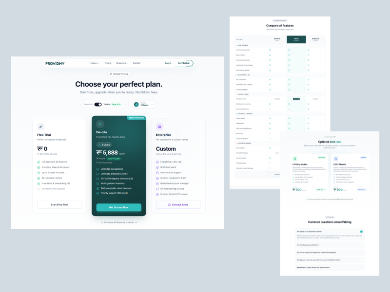
Pricing page: before & after
Before
Confusing tier structure. No differentiation between plans. Payment required for trial. No FAQ or
objection handling.
Dedicated page with module specific value prop, features, screenshots, and customer use case. Designed
for SEO targeting.
SALES MODULE PAGE
Highlights invoicing, quotations, payment tracking. Includes "See how it works" video walkthrough and
testimonial from a retail business.
ACCOUNTING MODULE PAGE
Emphasizes Nepali tax compliance (VAT, TDS), IRD integration, and localized fiscal year support.
Addresses accountant specific concerns.
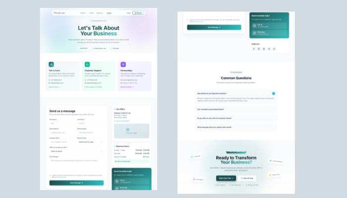
CONTACT PAGE
Contextual contact options: Book Demo, Get Support, Partnerships. Live chat widget. Expected response
time transparency.
BLOG HUB
Category filtering (Product Updates, Accounting Tips, Business Growth). Featured articles. Search bar.
Designed for thought leadership + SEO.
Documentation & Tutorials hub: Searchable help articles, video walkthroughs,
step by step setup guides. Designed to reduce onboarding support tickets and improve self serve product
activation.
Design system continuity
The website redesign extended the same design system built for the ERP product, same typography, same color
palette, same component patterns. This created a seamless brand experience
from marketing site → product trial → active usage. A visitor seeing the website immediately recognizes the
product interface, reducing cognitive friction during onboarding.
Current Status & Next Steps
Design Status: ✓ Complete and handed off to engineering Development Status: In progress, targeting launch Q2 2025 Post-Launch Plan: Run A/B tests on hero messaging, track trial signup conversion rate,
monitor bounce rate by page, collect qualitative feedback from sales team on lead quality, iterate based
on real user behavior data.
This case study will be updated with performance metrics and insights post-launch.